Val d’Arvienne 1750 (Ski & Snowboard Resort)
About Val d’Arvienne 1750
(Concepting exercise for mock entity) Val d’Arvienne 1750 is an expansive ski resort in the French Alps. With more than 300km of piste, it is one of the larger resorts in France, and Europe, but not as commercial as some of it’s better known neighbours like Chamonix and Val d’Isere. It is known throughout the region as ‘The Big Local’ for its cosy, intimate atmosphere on a grand scale.
The resort centre sits at 1750m altitude and rises to an elevation of 3200m. During the winter season Val d’Arvienne offers some of the best skiing and snowboarding facilities in the world.
The challenge
Although one of the larger French ski resorts, Val d’Arvienne is not well known outside of France. In order to promote it, the Val d’Arvienne tourist office have put together an eGuide on the hidden gems found among its many varied terrains and restaurants.
Their aim was to advertise this eGuide as a free download, with subscribers adding their address to Val d’Arvienne’s email list.
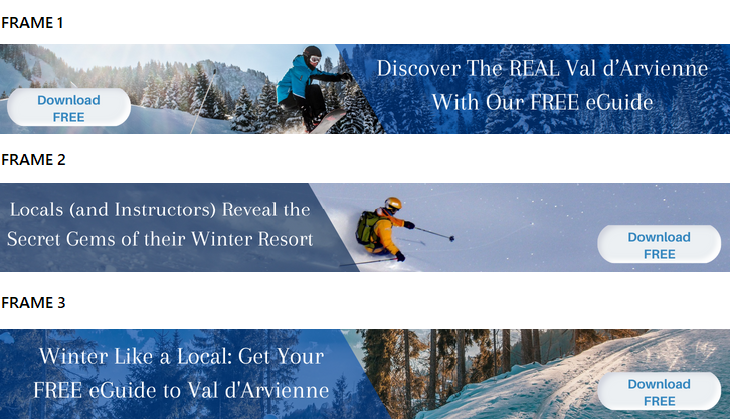
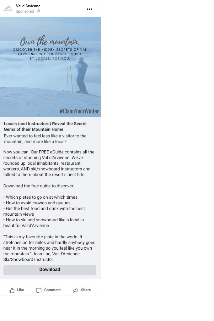
The creative brief called for a Facebook and Instagram advertisement, as well as a three-frame ‘leaderboard’ banner advertisement, to entice skiers and snowboarders to download the eGuide.
The solution
Who is the resort’s tourist persona? What might they be looking for in a ski/snowboard holiday and how will the guide deliver on that?
Winter sports tourists generally take guided lessons as beginners, but as they progress usually prefer to discover the slopes and their hidden gems in small groups, including families. For a large resort like Val d’Arvienne, it’s almost impossible to use every piste in just one week, so there’s a sense of potentially missing out on the best bits.
The eGuide would give them that inside knowledge and ensure they get to know the resort as well as a local, ensuring they squeeze every inch out of that precious week’s holiday. For that reason, copy that includes terms like ‘local’, ‘secret’ and ‘discover’ would make effective keywords to draw the reader in and highlight the benefit of downloading the guide.
It was also important to highlight that the guide was free. The banner ads feature download buttons, even though a user can click anywhere on the image. This further emphasised that the download was free, but also made the call to action more compelling.
A quick note on banner advertisements: Google will add two little buttons when the ad is published. One is a cross to close the ad, the other takes the user to the settings/preferences. The important point is that these almost always appear in the top right corner, so any copy or important graphics need to be kept away from this area.
The Facebook copy allowed for a much more descriptive approach, including a leading question to entice the reader (and it’s always key to answer that question, or at least explain how it’s going to be addressed).
All formats made use of brackets in title areas. Brackets convey a feeling of intimacy and revelation, as though the reader is being let in on a secret – a notion that fit this campaign perfectly.
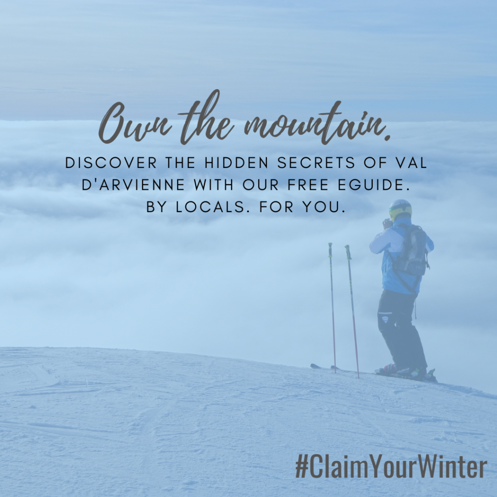
In addition, the hashtag #ClaimYourWinter was catchy and would help grow publicity as the concept was shared across social channels.


Val d’Arvienne 1750 (Scroll down for advertisement images)
About Val d’Arvienne 1750
(Concepting exercise for mock entity) Val d’Arvienne 1750 is an expansive ski resort in the French Alps. With more than 300km of piste, it is one of the larger resorts in France, and Europe, but not as commercial as some of it’s better known neighbours like Chamonix and Val d’Isere. It is known throughout the region as ‘The Big Local’ for its cosy, intimate atmosphere on a grand scale.
The resort centre sits at 1750m altitude and rises to an elevation of 3200m. During the winter season Val d’Arvienne offers some of the best skiing and snowboarding facilities in the world.
The challenge
Although one of the larger French ski resorts, Val d’Arvienne is not well known outside of France. In order to promote it, the Val d’Arvienne tourist office have put together an eGuide on the hidden gems found among its many varied terrains and restaurants.
Their aim was to advertise this eGuide as a free download, with subscribers adding their address to Val d’Arvienne’s email list.
The creative brief called for a Facebook and Instagram advertisement, as well as a three-frame ‘leaderboard’ banner advertisement, to entice skiers and snowboarders to download the eGuide.
The solution
Who is the resort’s tourist persona? What might they be looking for in a ski/snowboard holiday and how will the guide deliver on that?
Winter sports tourists generally take guided lessons as beginners, but as they progress usually prefer to discover the slopes and their hidden gems in small groups, including families. For a large resort like Val d’Arvienne, it’s almost impossible to use every piste in just one week, so there’s a sense of potentially missing out on the best bits.
The eGuide would give them that inside knowledge and ensure they get to know the resort as well as a local, ensuring they squeeze every inch out of that precious week’s holiday. For that reason, copy that includes terms like ‘local’, ‘secret’ and ‘discover’ would make effective keywords to draw the reader in and highlight the benefit of downloading the guide.
It was also important to highlight that the guide was free. The banner ads feature download buttons, even though a user can click anywhere on the image. This further emphasised that the download was free, but also made the call to action more compelling.
A quick note on banner advertisements: Google will add two little buttons when the ad is published. One is a cross to close the ad, the other takes the user to the settings/preferences. The important point is that these almost always appear in the top right corner, so any copy or important graphics need to be kept away from this area.
The Facebook copy allowed for a much more descriptive approach, including a leading question to entice the reader (and it’s always key to answer that question, or at least explain how it’s going to be addressed). All formats made use of brackets in title areas. Brackets convey a feeling of intimacy and revelation, as though the reader is being let in on a secret – a notion that fit this campaign perfectly.
In addition, the hashtag #ClaimYourWinter was catchy and would help grow publicity as the concept was shared across social channels.
