Ice a Trail (Online winter sports magazine: iceatrail.com)
About Ice a Trail
Ice a Trail is an online winter sports magazine featuring interviews with the leading lights in the skiing, snowboarding, skating and sliding arenas. Guests include multi-Olympic Champions, World Champions, record holders and other trailblazers/adventurers. You can find them at iceatrail.com
The challenge
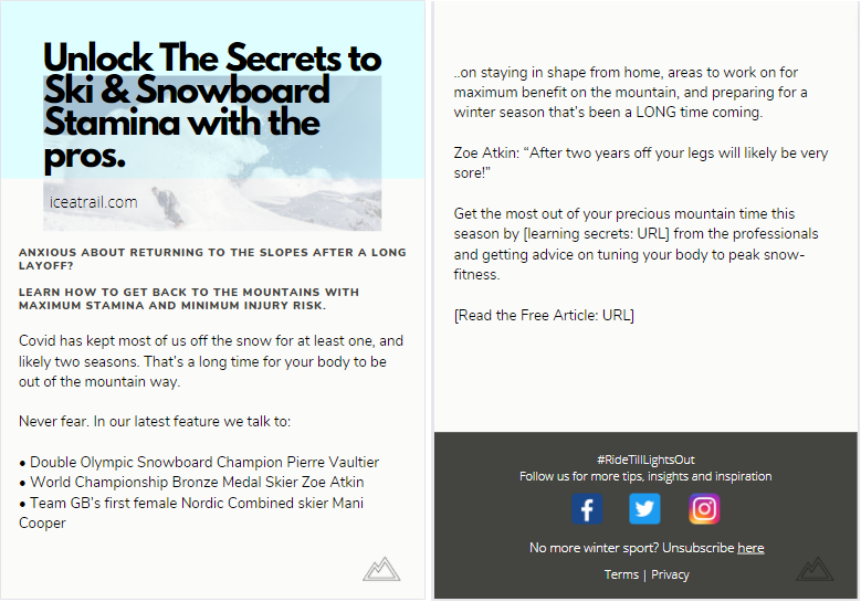
Ice a Trail published a feature on returning to the mountain after a long layoff. Since many people have been unable to take their winter holidays due to Covid-19, the feature covered the best ways to prepare your body and get snow-fit. This included tips from a World Championship bronze medallist, a double Olympic Champion, and Team GB’s first female Nordic Combined athlete.
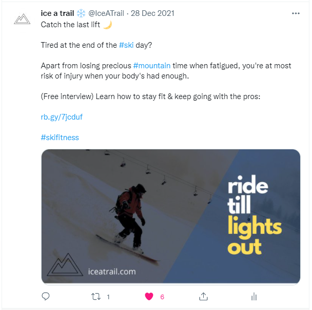
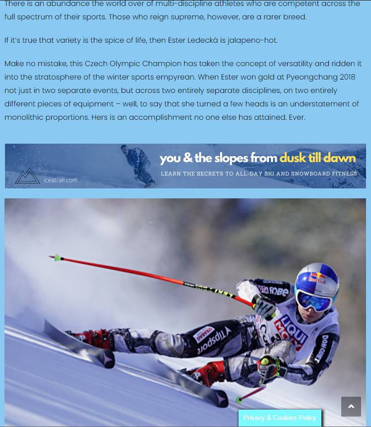
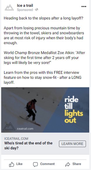
The creative brief called for ads to run across the magazine’s Facebook/Instagram feeds, as well as a three frame banner advertisement, an email to their subscribers, and a Twitter post. The aim of the campaign was to drive traffic to the magazine feature page.
The challenge with this project lay in writing a message that was congruent across all mediums, which meant telling the same story and conveying the same benefit in several hundred words (for the email), less than ten (for the banner advertisements), or somewhere between the two (for the tweet).
The solution
For any multi-channel campaign it’s important to create a common theme and hone this into a simple message. The benefit to the reader of opening this article was learning how to best prepare for their upcoming winter holiday, and the ultimate result of this was that they would get a more quality ski/snowboard experience. In other words they’d be able to spend the whole day on the slopes without running out of steam – after all, holiday time is precious and you’ve got to make the most of every minute!
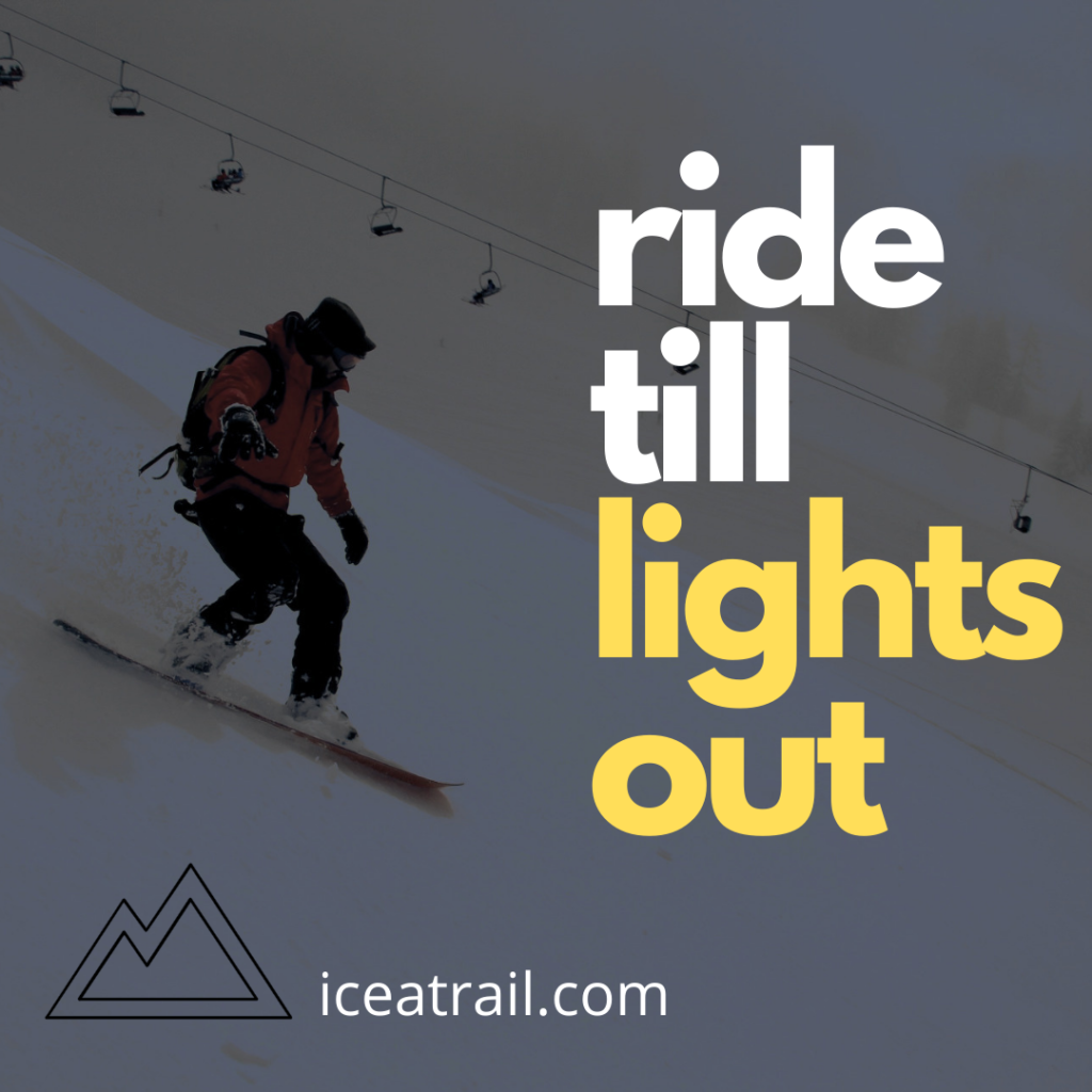
After focusing on this deeper benefit, the tagline ‘Ride Till Lights Out’ was conceived as a descriptor for that reader-benefit: it’s both simple and catchy, and conveys what the published feature is designed to achieve.
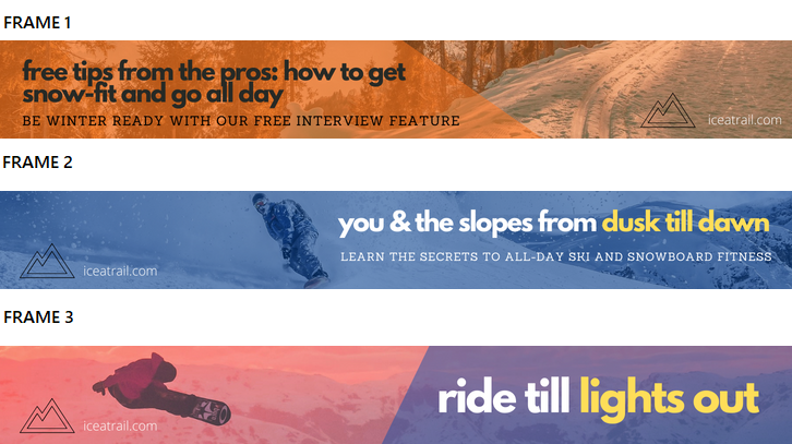
As with all banner ads, the message had to be conveyed effectively across all three frames so that together they tell a story. But of course it’s not possible to control which frame a viewer sees first, so the benefit to the reader has to be clear on each, and the story has to make sense if only one frame is viewed.
The Twitter post also had to be short and sweet, given the maximum character allowance of just 280. Having a tagline (which could be included on images) helped focus the message across all channels, regardless of wordcount.
The email copy offered more freedom and allowed for a question to be posed – a highly effective method to draw readers in – as well as a quote from the article itself.


Ice a Trail (scroll down for ad samples)
About Ice a Trail
Ice a Trail is an online winter sports magazine featuring interviews with the leading lights in the skiing, snowboarding, skating and sliding arenas. Guests include multi-Olympic Champions, World Champions, record holders and other trailblazers/adventurers. You can find them at iceatrail.com
The challenge
Ice a Trail published a feature on returning to the mountain after a long layoff. Since many people have been unable to take their winter holidays due to Covid-19, the feature covered the best ways to prepare your body and get snow-fit. This included tips from a World Championship bronze medallist, a double Olympic Champion, and Team GB’s first female Nordic Combined athlete.
The creative brief called for ads to run across the magazine’s Facebook/Instagram feeds, as well as a three frame banner advertisement, an email to their subscribers, and a Twitter post. The aim of the campaign was to drive traffic to the magazine feature page.
The challenge with this project lay in writing a message that was congruent across all mediums, which meant telling the same story and conveying the same benefit in several hundred words (for the email), less than ten (for the banner advertisements), or somewhere between the two (for the tweet).
The solution
For any multi-channel campaign it’s important to create a common theme and hone this into a simple message. The benefit to the reader of opening this article was learning how to best prepare for their upcoming winter holiday, and the ultimate result of this was that they would get a more quality ski/snowboard experience. In other words they’d be able to spend the whole day on the slopes without running out of steam – after all, holiday time is precious and you’ve got to make the most of every minute!
After focusing on this deeper benefit, the tagline ‘Ride Till Lights Out’ was conceived as a descriptor for that reader-benefit: it’s both simple and catchy, and conveys what the published feature is designed to achieve.
As with all banner ads, the message had to be conveyed effectively across all three frames so that together they tell a story. But of course it’s not possible to control which frame a viewer sees first, so the benefit to the reader has to be clear on each, and the story has to make sense if only one frame is viewed.
The Twitter post also had to be short and sweet, given the maximum character allowance of just 280. Having a tagline (which could be included on images) helped focus the message across all channels, regardless of wordcount.
The email copy offered more freedom and allowed for a question to be posed – a highly effective method to draw readers in – as well as a quote from the article itself.
